
Appearance
Manual Styling with CSS
Styling is achieved through app themes. Each app has its own theme settings, which can be adjusted in the theme menu. The default theme uses the font family and size defined on the page, with black as the primary color and an additional built-in palette for colorizing elements and shades. Premium users can customize fonts and colors via the theme menu.
The App Builder automatically adds numerous CSS classes to app elements — from the app container to individual table cells — enabling specific customizations for both premium and free users. An overview of the class hierarchy is provided below.
Class Hierarchy
- .pp-app-container.pp-app-{appId}
- .pp-component
- .pp-header
- .pp-table-container
- .pp-filter-container
- .{columnName}
- .pp-table (table container)
- .pp-top-toolbar
- table
- thead
- tr
- th.{columnName}
- tr
- tbody
- tr
- td.pp-table-column-actions (row actions column)
- td.pp-table-column-actions .pp-table-row-action (row actions container)
- td.pp-table-column-actions button.pp-table-column-action-view (view button)
- td.pp-table-column-actions button.pp-table-column-action-edit (edit button)
- td.pp-table-column-actions button.pp-table-column-action-delete (delete button)
- td.pp-table-column-actions .pp-table-row-action (row actions container)
- td.{columnName}
- td.pp-table-column-actions (row actions column)
- tr.Mui-TableBodyCell-DetailPanel
- td .pp-table-detail-panel-container (detail panel container)
- td .pp-table-detail-panel-container .pp-table-detail-panel (detail panels)
- td .pp-table-detail-panel-container .pp-table-detail-panel > div (detail panel row)
- td .pp-table-detail-panel-container .pp-table-detail-panel > div .label (detail panel row label)
- td .pp-table-detail-panel-container .pp-table-detail-panel > div .content (detail panel row content)
- tr
- tfoot
- tr
- th.{columnName}
- tr
- thead
- .pp-bottom-toolbar
- .pp-bottom-toolbar-container
- .pp-table-info
- .pp-bottom-toolbar-container
- .pp-form (form container)
- .pp-registration-form-message (registration forms only)
- .pp-component
- .pp-form-modal (modal form container)
- .pp-form
Scoped CSS
You can add custom CSS that applies exclusively to your data table using the CSS Table Editor. This can be done with the built-in CSS classes mentioned above or with custom CSS classes (explained in the next section). The CSS Table Editor supports scoped CSS, which ensures that your styles are only applied to elements belonging to your app and do not affect other content on the page.
For more information, follow the link below:
Adding Custom Classes
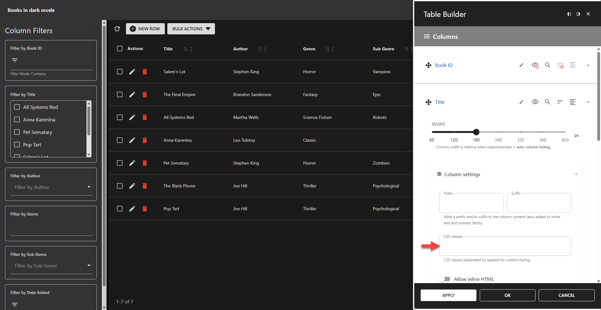
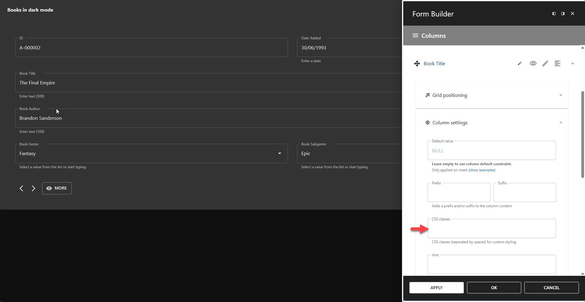
The class hierarchy outlined above is available by default. Additionally, you can assign custom CSS class names to table columns in the Table Builder and to form columns in the Form Builder. Custom CSS classes are used in the same way as the default ones.
Adding CSS Classes to Table Columns
Adding CSS Classes to Form Columns
Examples
✨ Example Styling Table Cells
css
.pp-table thead th,
.pp-table tbody td {
    color: red;
}
✨ Example Styling Filter Containers
css
.pp-table-container .pp-filter-container > * {
    background-color: yellow;
    color: red;
}
✨ Example Styling Form Input Labels
css
.pp-app-container .pp-component .pp-form .MuiInputLabel-root{
    color: orange;
    font-weight: bold !important;
    font-style: italic !important;
}
✨ Example Styling Form Input Labels on Modal Forms
css
.pp-modal-form .pp-form .MuiInputLabel-root{
    color: orange;
    font-weight: bold !important;
    font-style: italic !important;
}
Notes
- Do not use the ID assigned to an app container, as it changes with each page load and is intended for internal use only.
- Use the CSS Table Editor to add scoped CSS if you need to display multiple instances of the same app on a single page with different styles.