
Appearance
Palette
The color palette is very easy to use. All elements are styled uniformly using your selected color, and a contrasting color is automatically assigned for optimal readability.
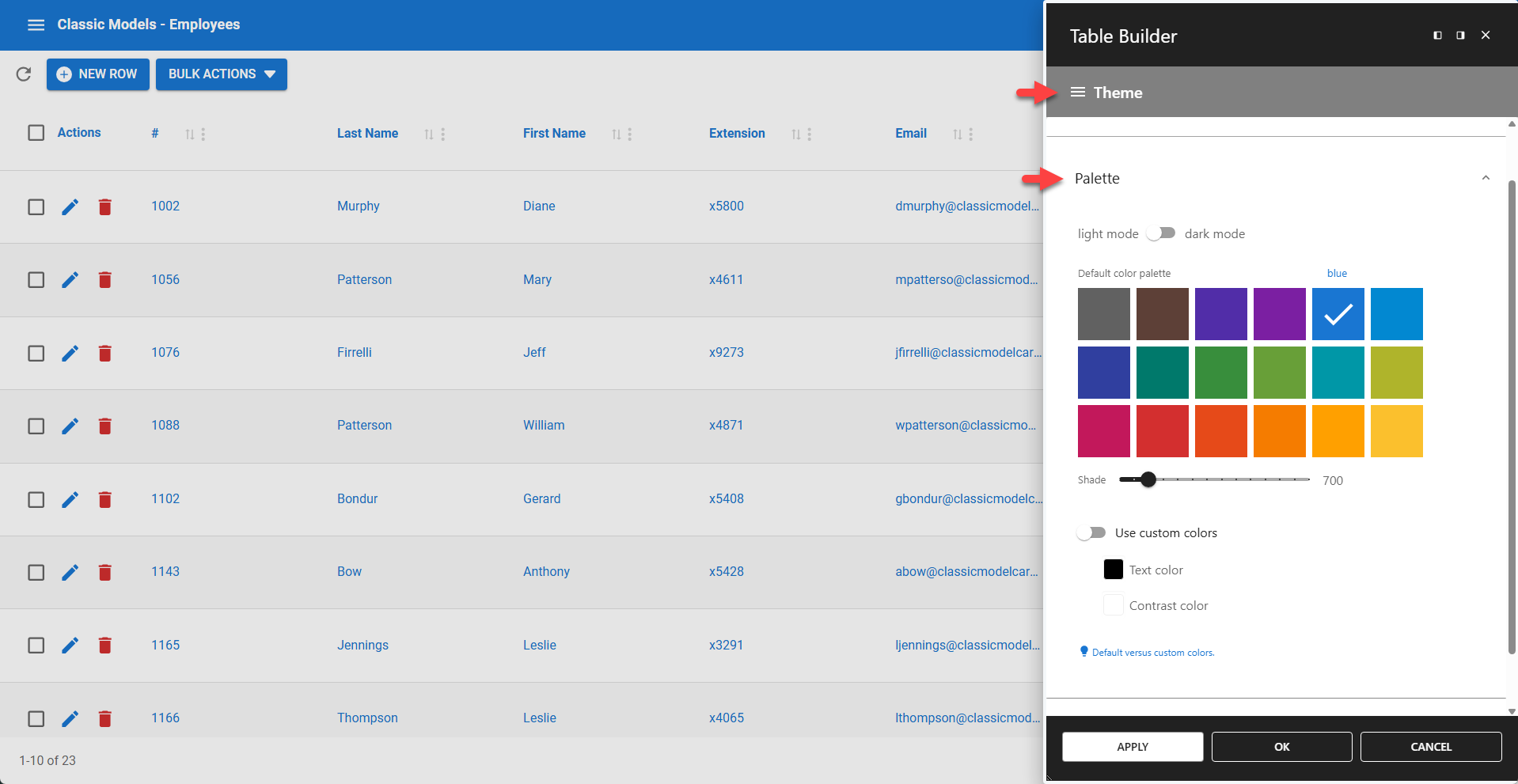
⚙️ Light | Dark Mode
Use this switch to view your app in light or dark mode. The color tones are automatically adjusted for each theme. This setting only affects the app container and does not change the rest of the web page.
⚙️ Default Color Palette
This palette offers 24 colors with 14 shades each, allowing for many combinations. When you select a color, it is applied uniformly to all relevant elements. A contrasting color is automatically assigned based on your selection.
⚙️ Use Custom Colors
The custom color option requires you to define a contrast color. This is the color used for text that appears on elements with your main custom color as the background.