Appearance
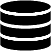
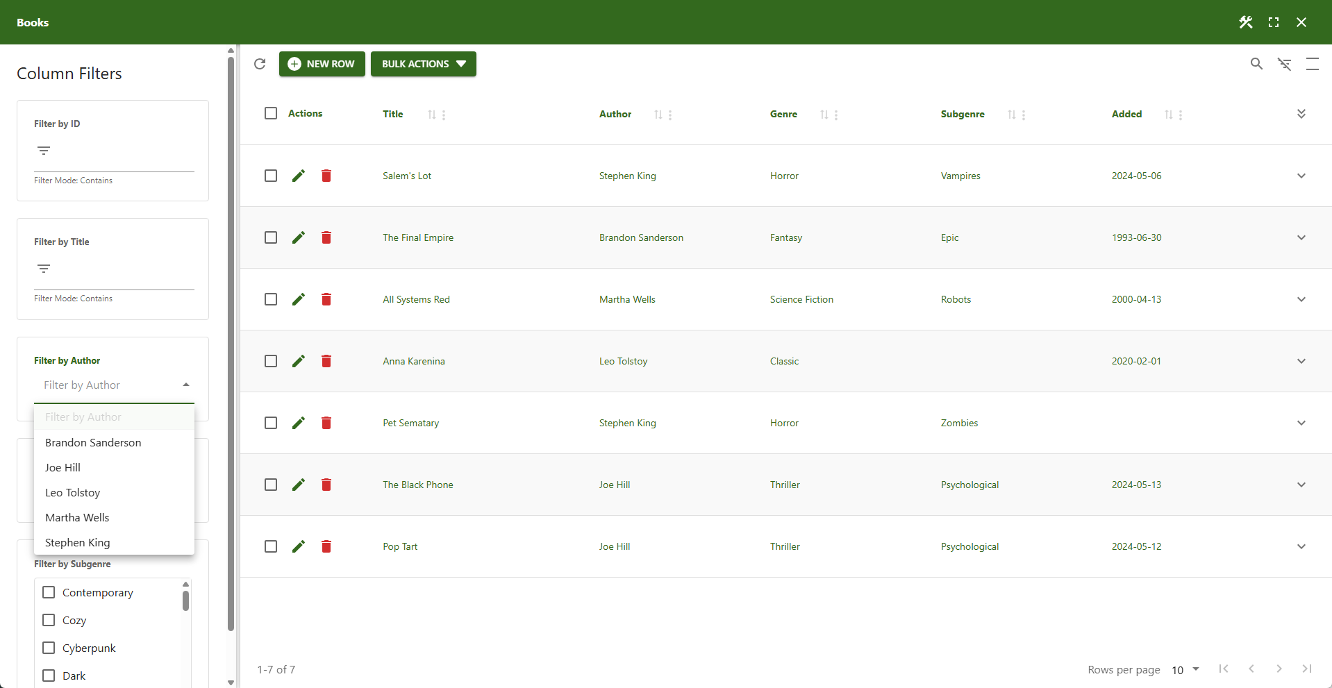
Column Filters
Although column filters are defined per column, these general settings apply to all of them.
⚙️ Enable Column Filters
This option is enabled by default. Disabling it will disable all column filters.
⚙️ Show Column Filters on Startup
When enabled, column filters are displayed immediately when the table loads.
📌 Changes take effect after the next page load.
⚙️ Always Show Column Filters
Permanently displays the column filters. This option removes the column filter icon button, making it impossible for users to hide them.
⚙️ Cascade Drop-Down Lists
Automatically updates dependent drop-down lists when search criteria change. This feature is enabled by default for client-side processing. It does not affect the global filter or searchbox column filters.
📌 This feature van have a negative impact on performance when used in combination with server-side processing.
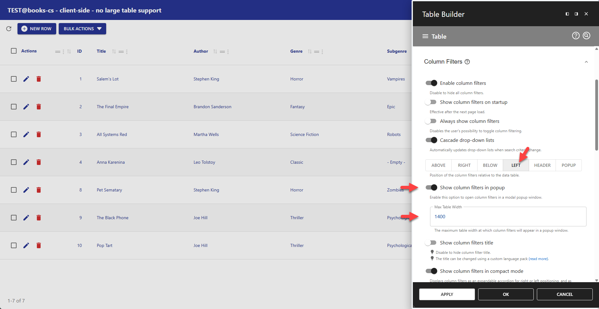
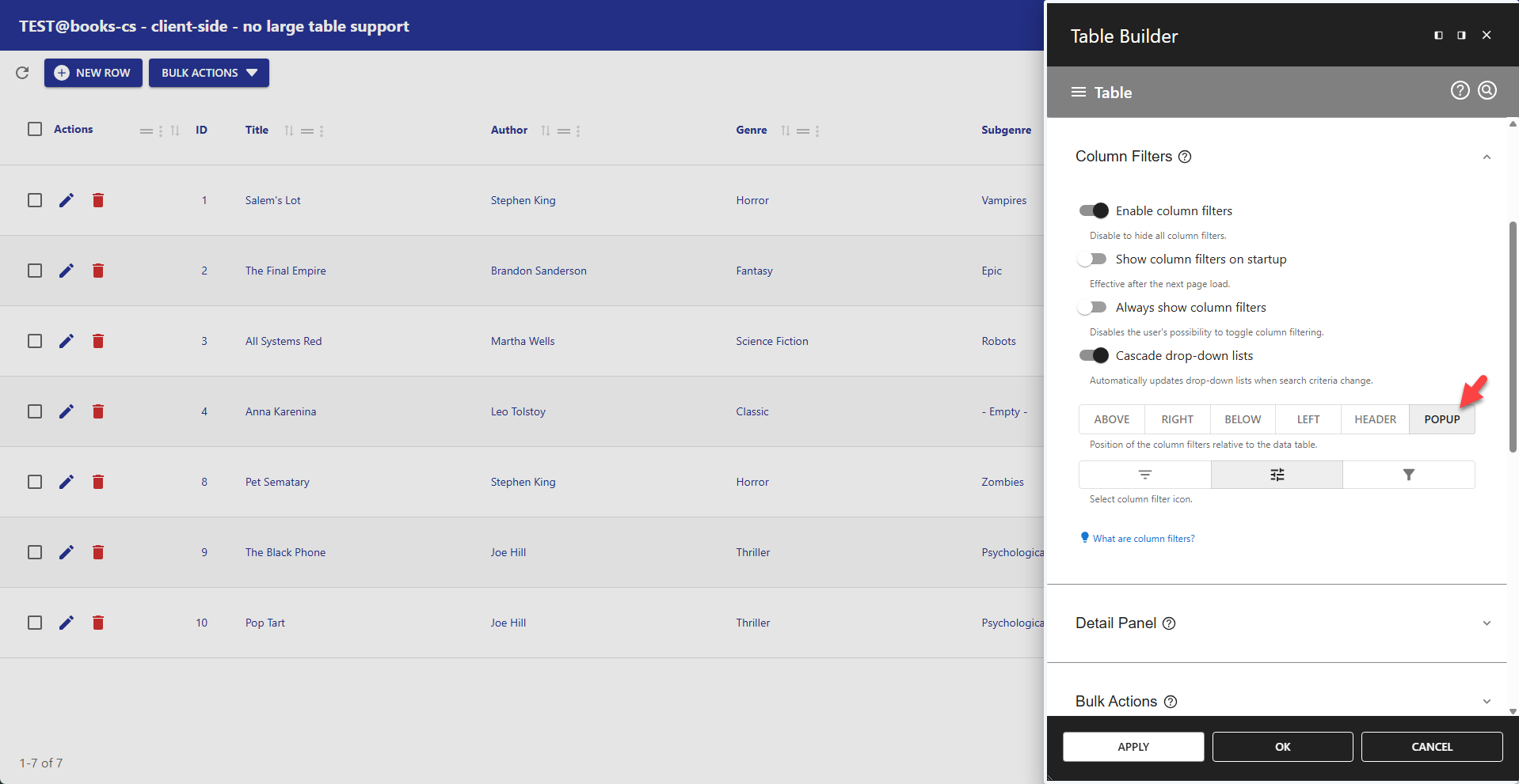
⚙️ Positioning
Column filters can be displayed in a dedicated container or within the table header. If using a container, you can define its position relative to the data table.
- ABOVE – Positions the container above the data table.
- RIGHT – Positions the container to the right of the data table.
- BELOW – Positions the container below the data table.
- LEFT – Positions the container to the left of the data table.
- HEADER – Positions each filter in its respective column header.
- POPUP – Displays the container in a popup.
📌 For detail tables, column filters are always displayed in the header; a container is not supported.
⚙️ Show Column Filters Title
Disable to hide column filter title.
📌 Alternatively, the title can be changed using a custom language pack (read more).
⚙️ Show Column Filters in Compact Mode
Displays column filters as an expandable accordion for right or left positioning, and as drop-down filters for top or bottom positioning (see examples below).
⚙️ Expand Column Filters on Startup
Only available if filters are right or left positioned. Defines the initial column filters state.
⚙️ Column Filters Width
Defines the exact width (e.g., 340px) for the column filters container when the position is set to LEFT or RIGHT. This setting has no effect on other positions.
⚙️ Column Filter Icon
Select your preferred column icon here.
Examples
✨ Example Compact Drop-Down Column Filters
Compact, permanently visible column filter that uses minimal space.
- Always show column filters = enabled
- Position = ABOVE
- Show column filters title = disabled
- Show column filters in compact mode = enabled
- Highlight color = #6692ea (Global Filter settings)
👉 Active column filter buttons are displayed as primary buttons.
👉 Inactive column filter buttons are displayed as secondary buttons.
📌 All multi-selectable lists are converted into multi-select search panes
📌 All single-selectable lists are converted into single-select search panes
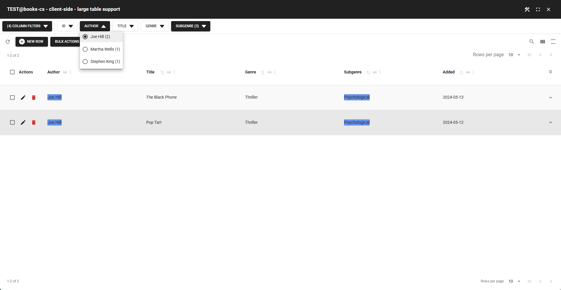
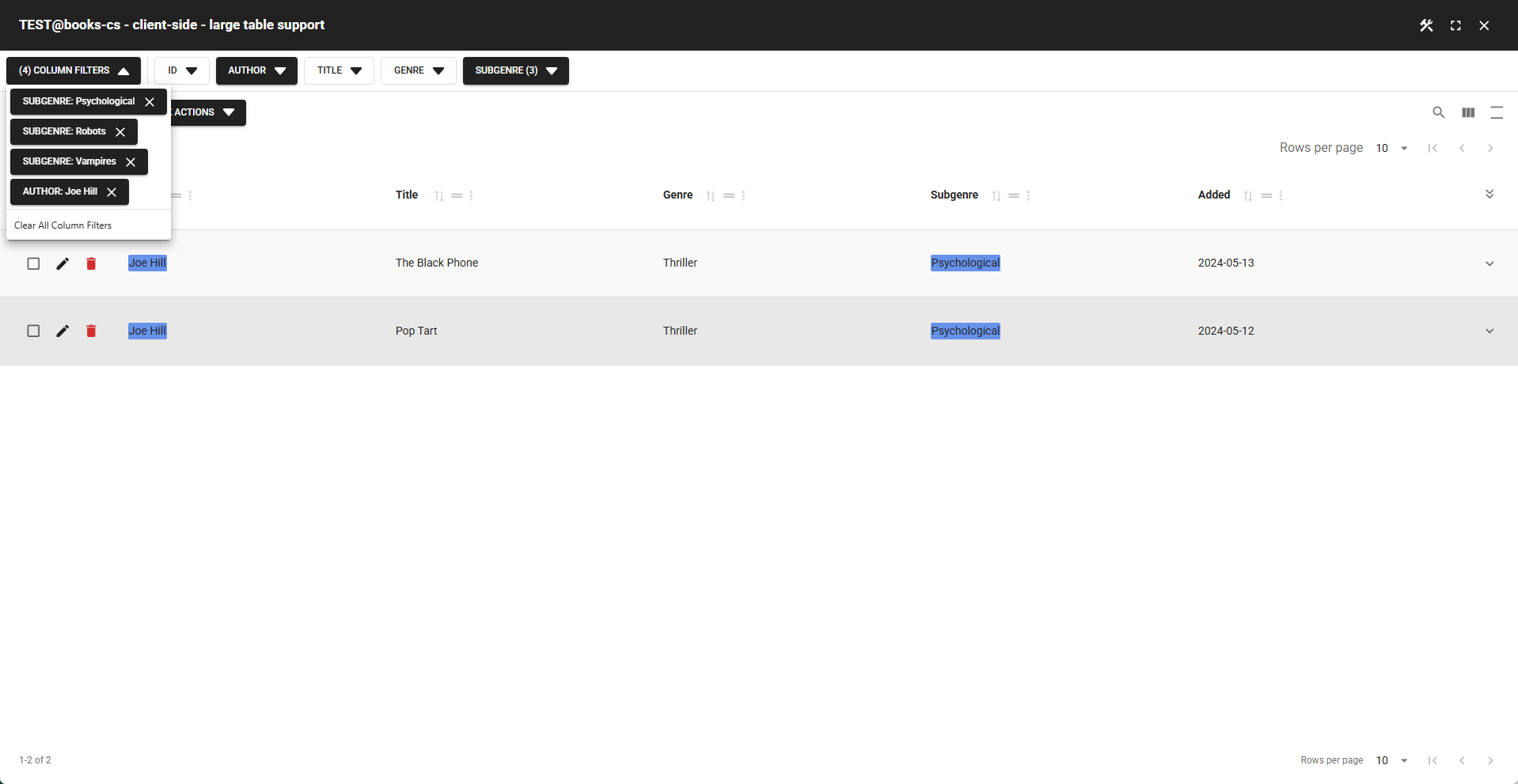
📌 The "Clear All Column Filters" button is enabled when at least one column filter is active
✨ Example Column Filters Popup
The popup feature is ideal for mobile devices, saving screen space while keeping filters accessible. It can be combined with the left-side position or used on its own.
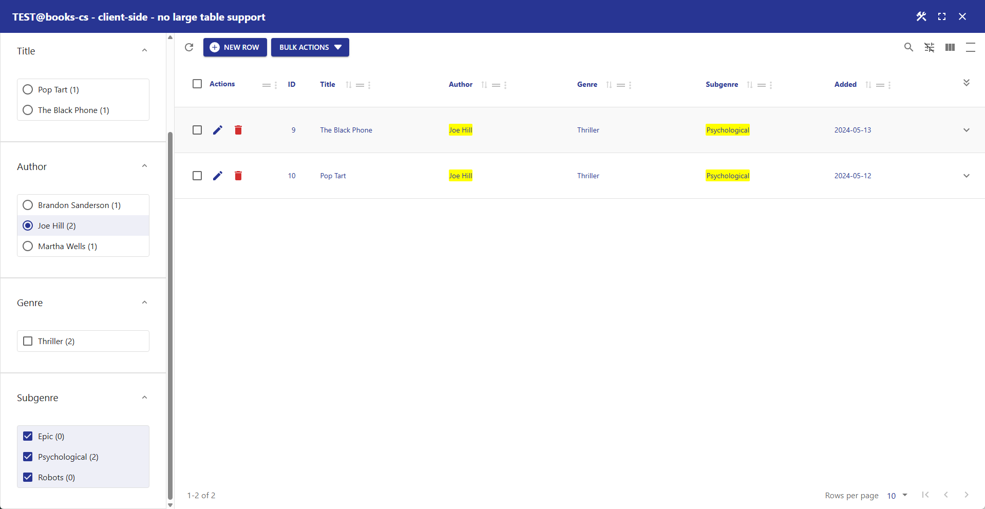
📌 Position Left with Popup and Width
When you select left with popup, the width setting determines the maximum table width at which column filters will appear in a popup window. If the screen is wider than the specified width, filters are shown to the left of the table.
📌 On a monitor (wide screen) – filters appear to the left of the table
📌 On a smartphone (narrow screen) – filters appear in a popup
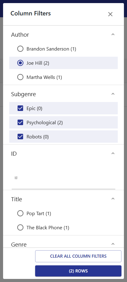
📌 Position Popup Only
Select position popup to show column filters permanently in a popup window, regardless of screen width.
✨ Example Accordion-Styled Column Filters
An accordion-style column filter that allows users to view multiple filters at once, with the ability to expand and collapse them as needed.
- Always show column filters = disabled (allows user to hide column filters)
- Position = LEFT
- Show column filters title = disabled
- Show column filters in compact mode = enabled
- Highlight color = #6692ea (Global Filter settings)
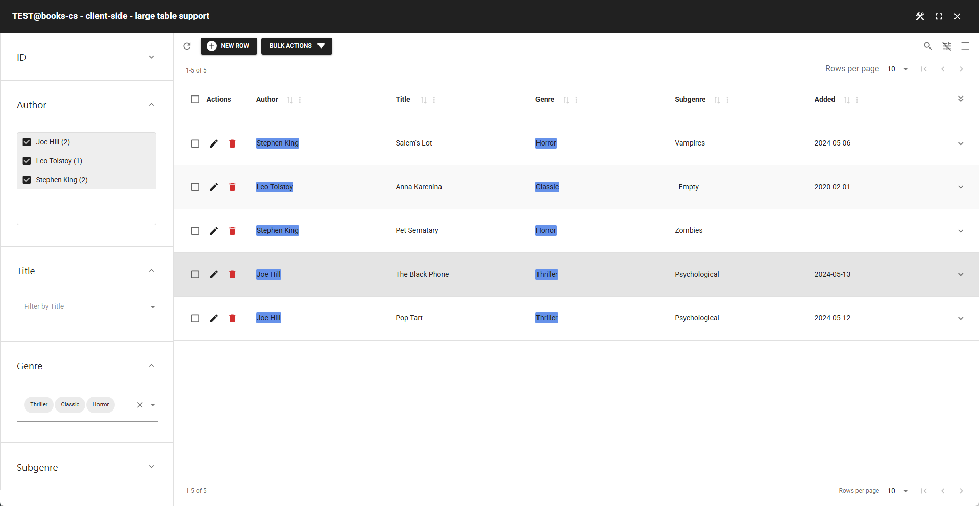
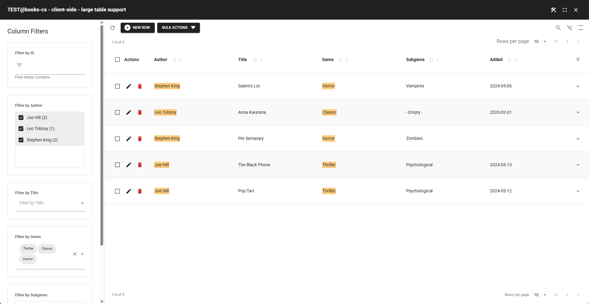
✨ Example Default Column Filters
Using mostly the default column filter settings and default hightlight color (#ffcb7f in Global Filter settings).