
Appearance
Detail Panel
⚙️ Allow Detail Panel Viewing
Adds an expand icon to each row, allowing users to view row details in a dedicated panel.
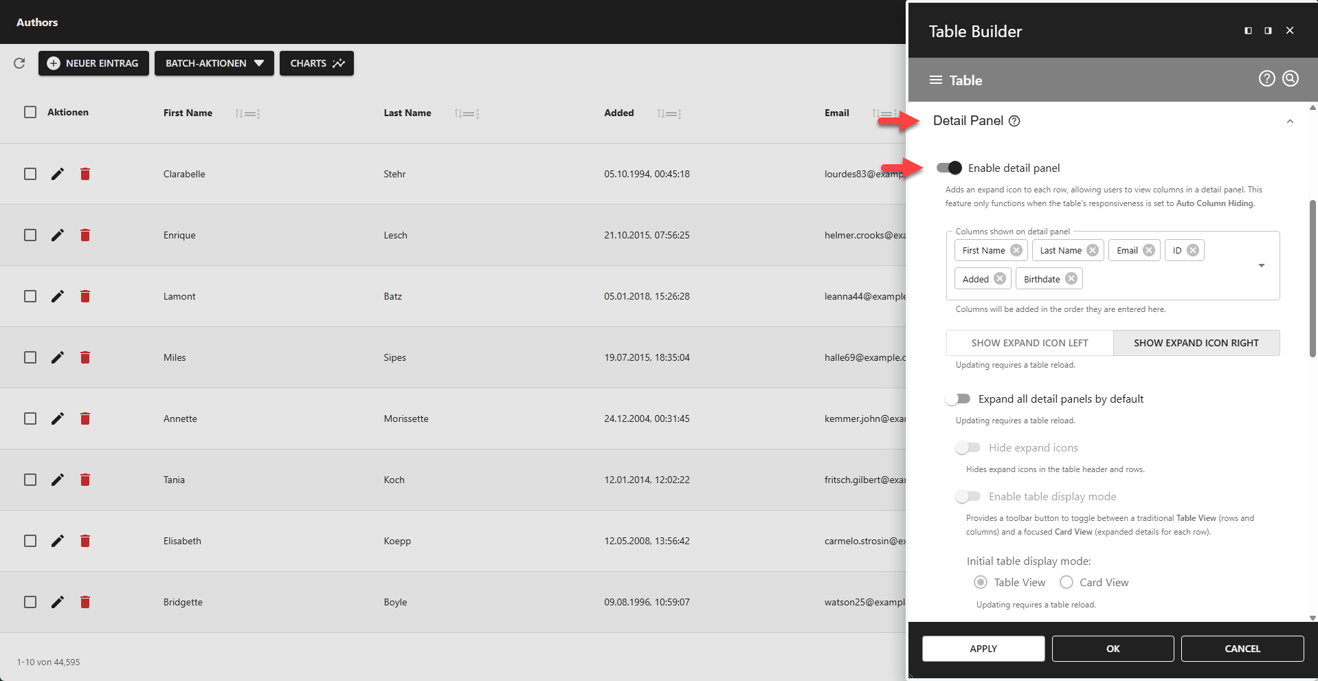
📌 This feature only functions when the table's responsiveness is set to Auto Column Hiding.
⚙️ Columns Shown on Detail Panel
Adds columns to the detail panel in the order they are added to this field.
⚙️ Expand Icon Position
Defines the position of the expand icons (LEFT or RIGHT).
⚙️ Expand All Detail Panels By Default
Use this feature to expand all rows on startup.
⚙️ Hide Expand Icons
Hides all expand icons in the table header and footer.
📌 Only available if Expand All Detail Panels By Default is enabled.
⚙️ Enable Table Display Mode
Adds a toolbar button to toggle between a traditional Table View (rows and columns) and a focused Card View (expanded details for each row).
𝄜 Table View
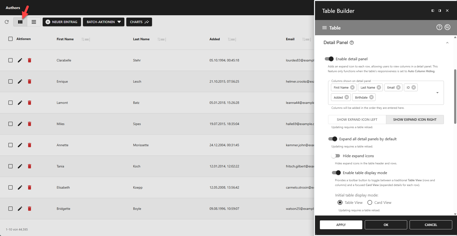
🪪 Card View
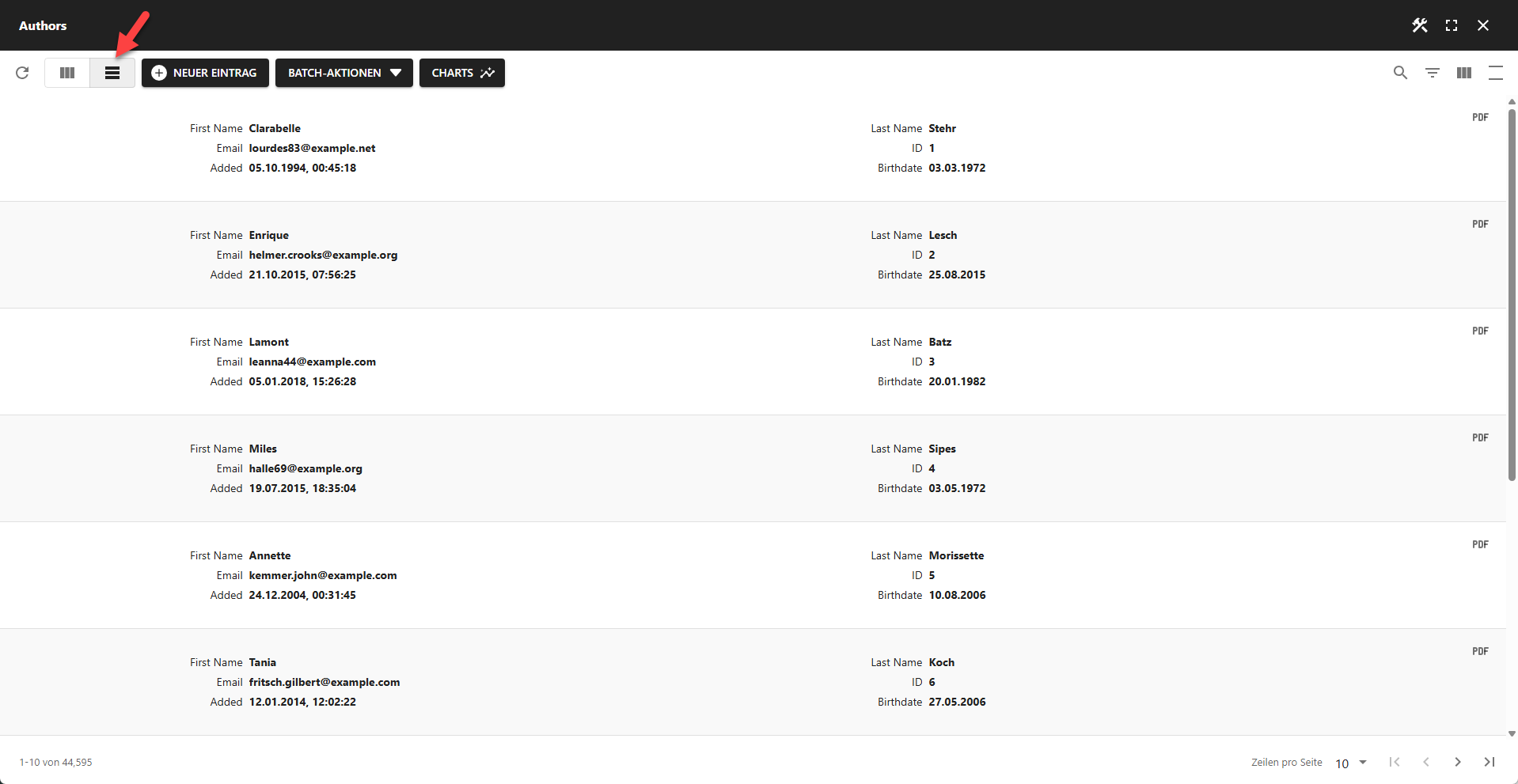
📌 The Card View is only available if Expand All Detail Panels By Default is enabled.
⚙️ Initial Table Display Mode
Table View - Start app in Table View mode.
Card View - Start app in Card View mode.
🙈 Hide Toggle Button
You can hide the toggle button used to switch between Table View and Card View by adding custom CSS in the CSS Table Editor. Once hidden, the table view becomes inaccessible, and your app will function solely as a card grid.
css
/* Hide table view|card view switch button. */
.pp-table-card-button {
  display: none;
}
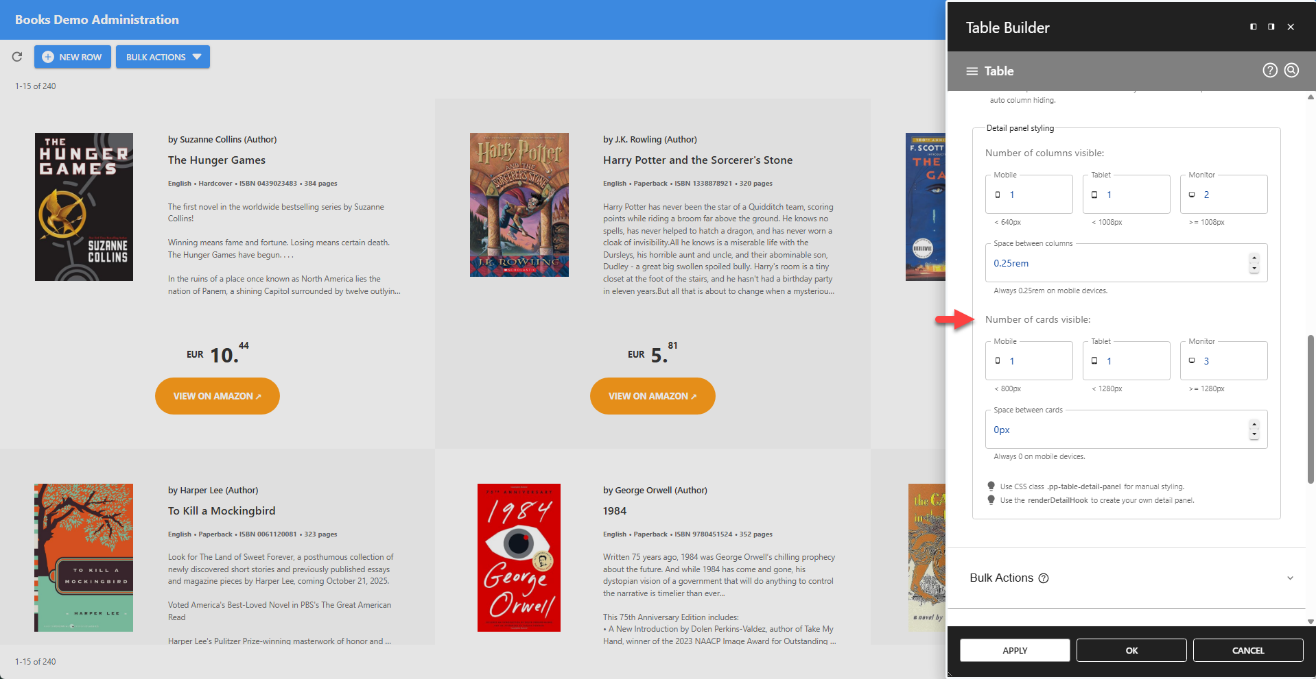
⚙️ Multiple Cards Per Row
✨ The screenshot below demonstrates a layout with three cards per row on a desktop monitor. For smaller devices, the number of cards displayed per row can be adjusted in the Detail Panel section.
</> The renderDetailPanel Hook
The cards shown in the screenshot above are generated using the renderDetailPanel hook and styled through the CSS Table Editor.
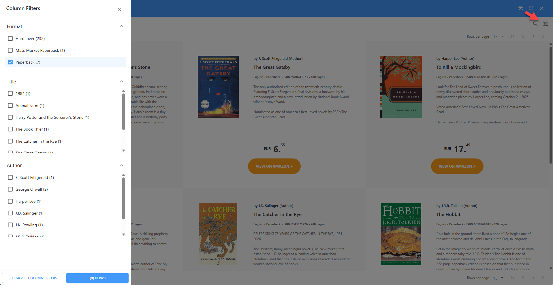
🔎︎ Column Filter With Cards
Column filters remain fully functional when Card View is enabled and Table View is disabled.
⚙️ Add PDF Export Icon
If detail panel viewing is enabled, this option adds a PDF Export icon to the detail panel, allowing users to export the specific row's data to a PDF file.
⚙️ Detail Panel Styling
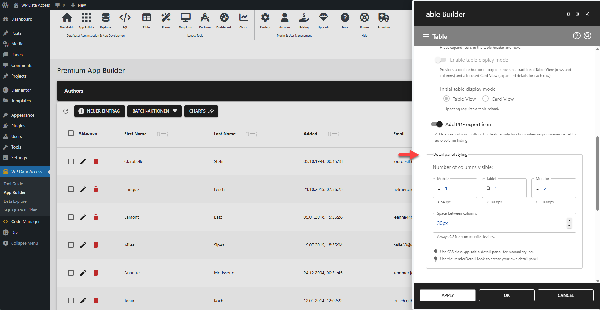
Number of Columns Visible
⚙️ Mobile
Number of columns shown on mobiles (width < 640px).
⚙️ Tablet
Number of columns shown on tables (width < 1008px).
⚙️ Monitor
Number of columns shown on PC's and laptops (width >= 1008px).
⚙️ Space Between Columns
Space between columns.
📌 Always 0.25rem on mobile devices.
💡 CSS Styling
Use CSS class .pp-table-detail-panel for manual styling. Read more...
💡 Custom Detail Panel
Use the renderDetailHook to create your own detail panel. Read more...